
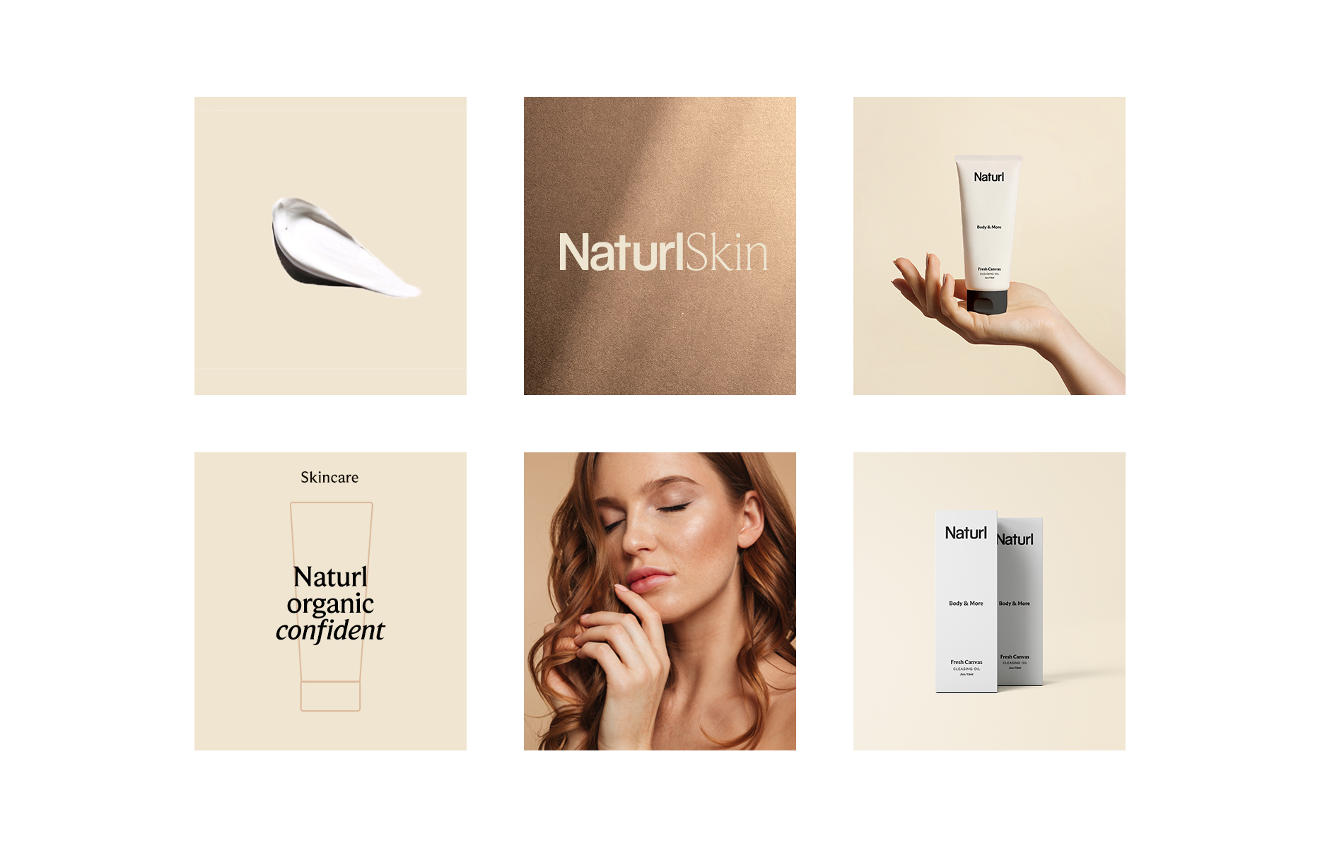
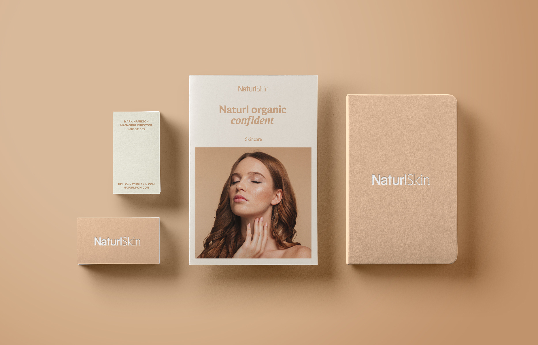
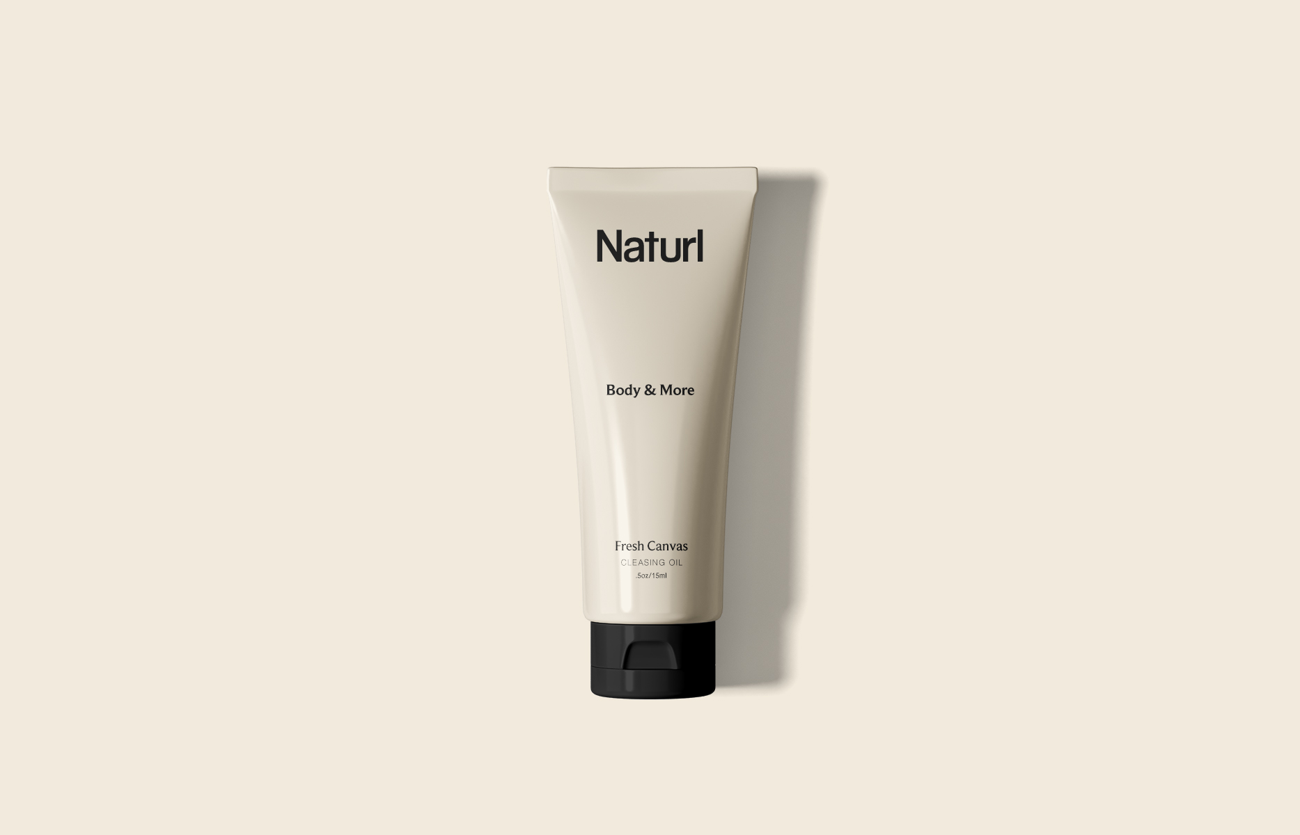
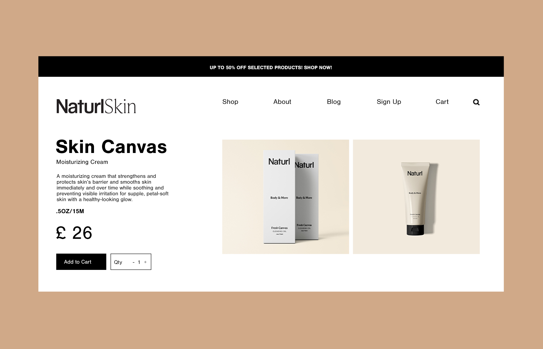
Skincare Brand Development
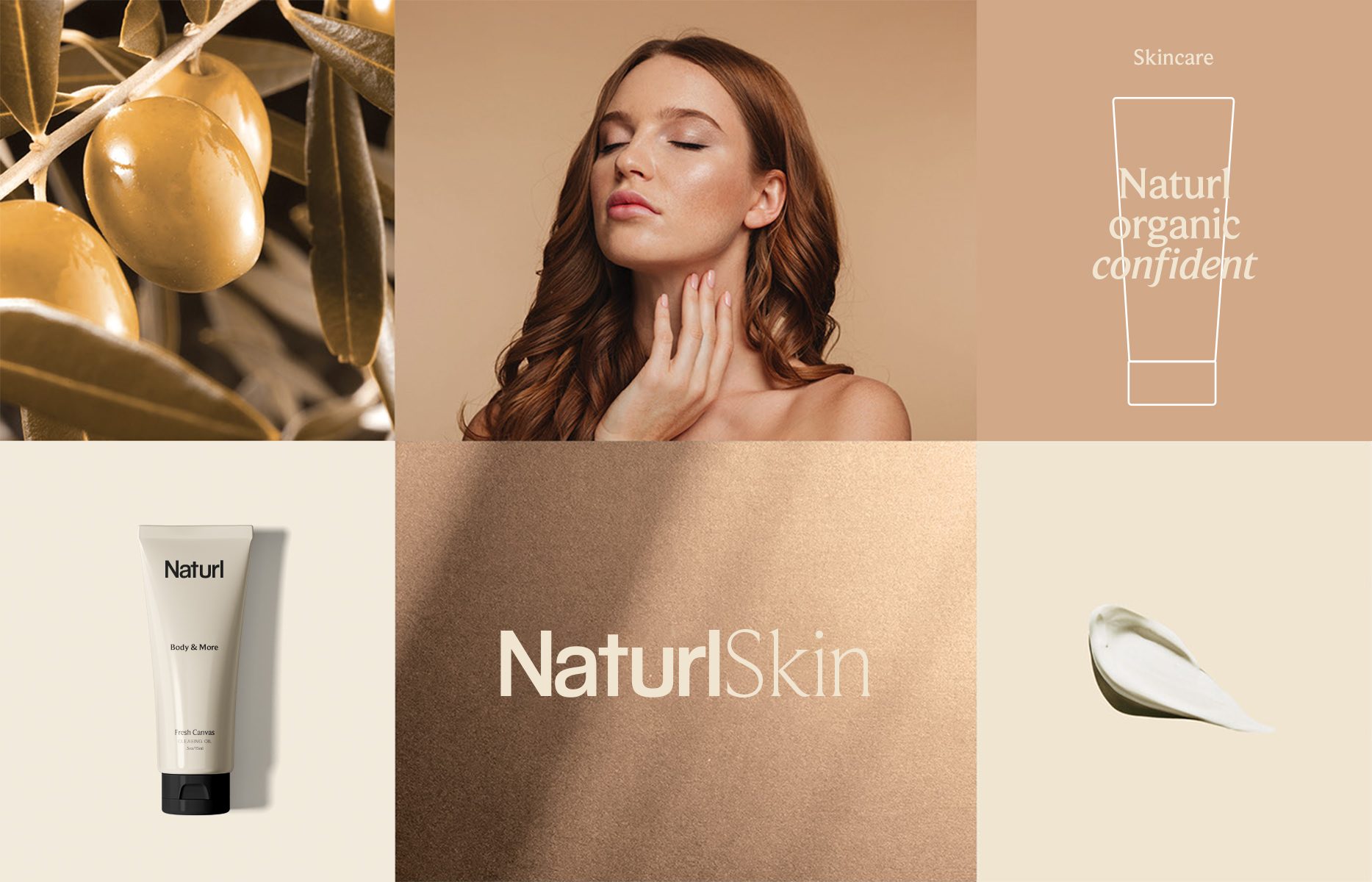
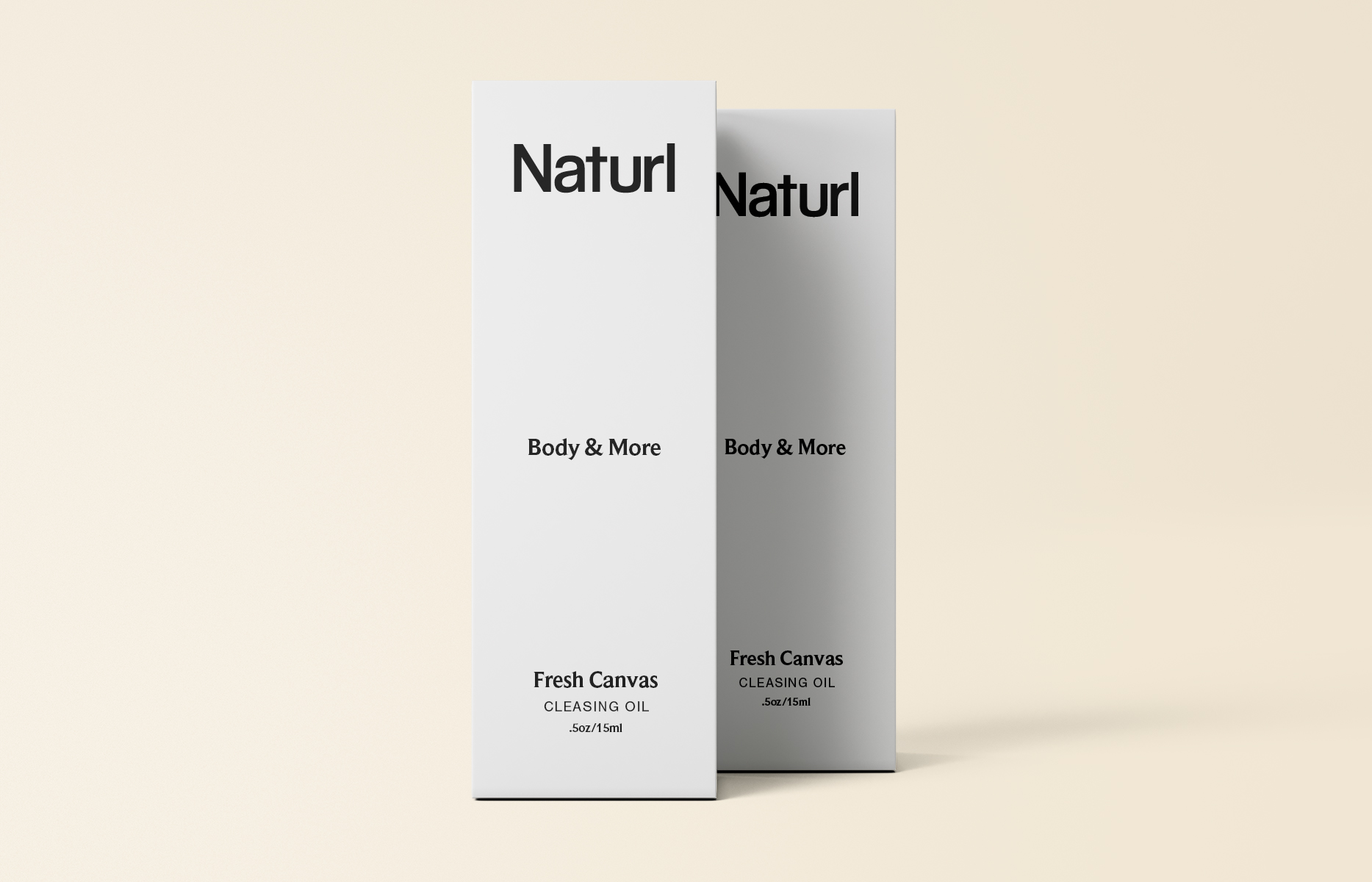
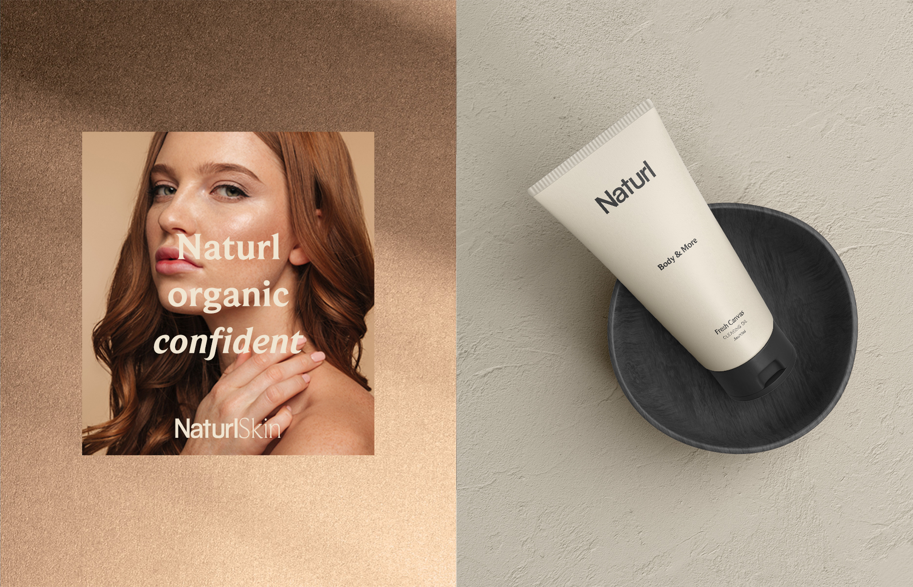
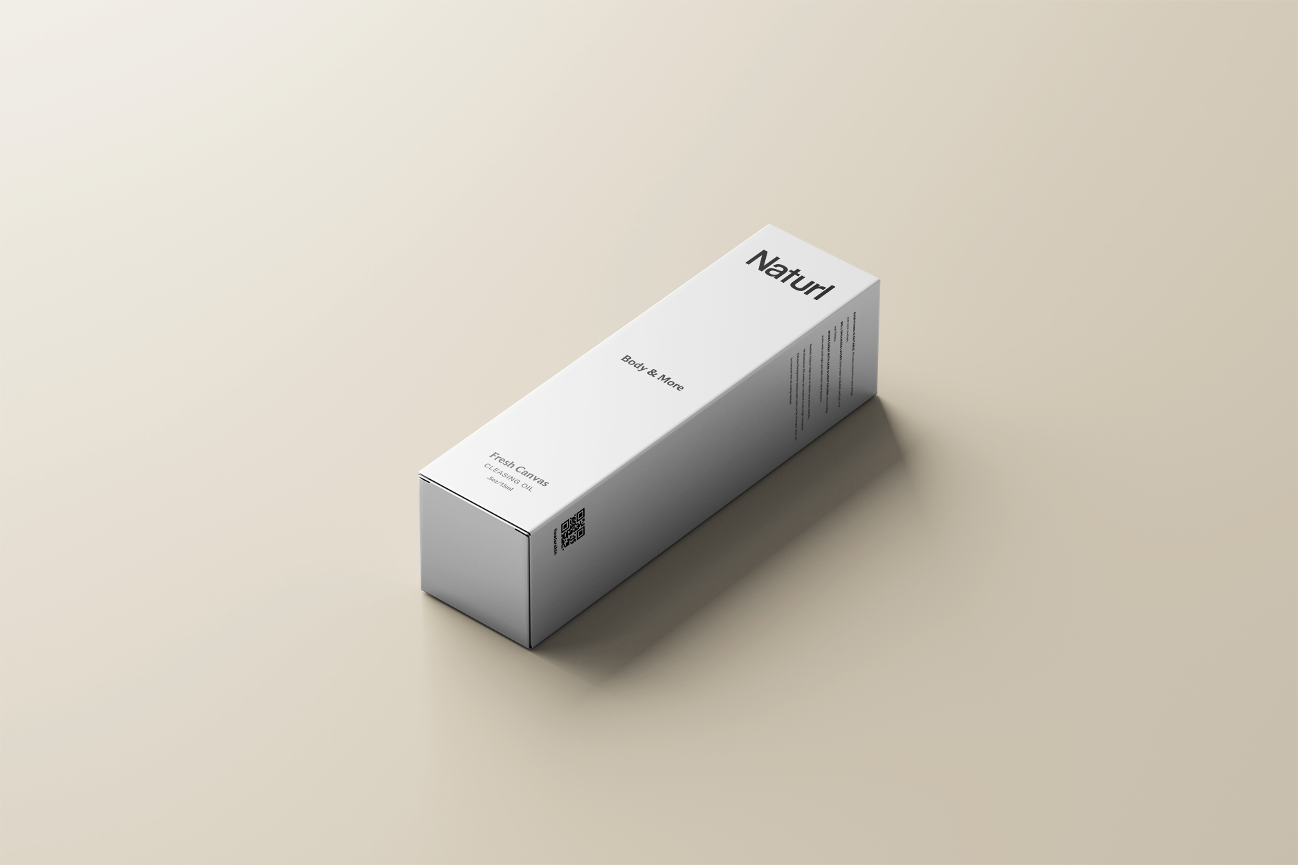
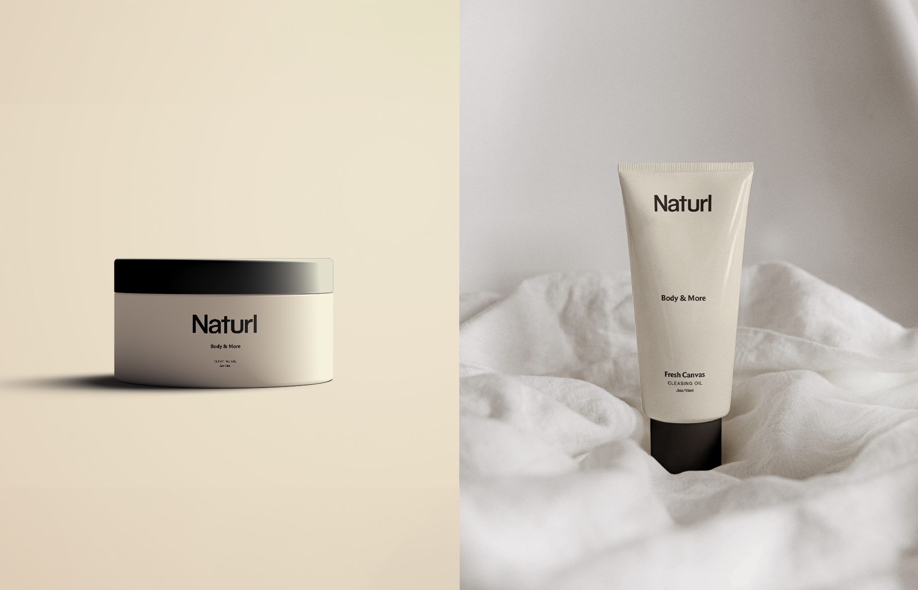
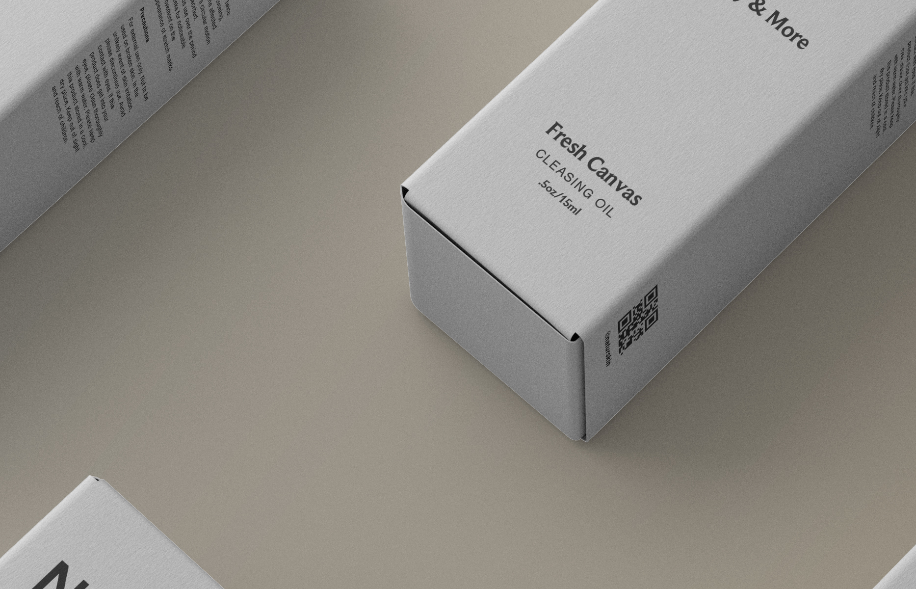
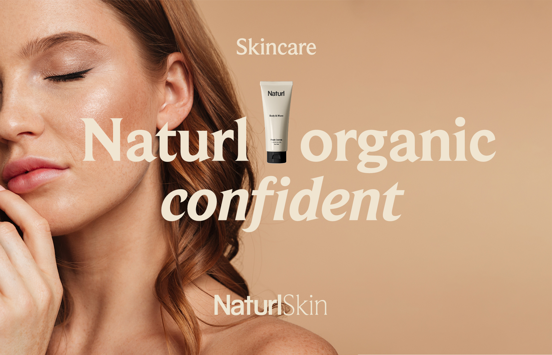
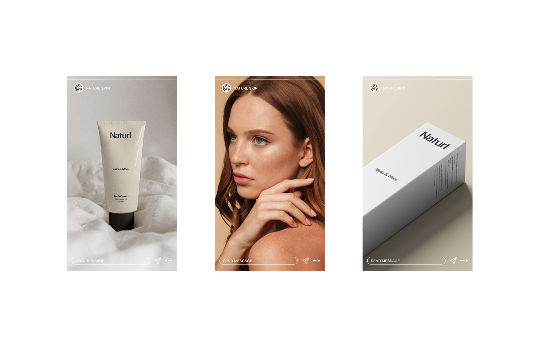
There is no denying that in recent years natural and organic brands have proliferated, Naturl Skin is one of them; but it is also true that many start in a rustic or homemade way and their visual identity, at least initially, does not usually have the necessary work to be competitive internationally.
Task
Naturl Skin comes to the studio for a rebranding, with a product that wants to compete internationally and with the request that the identity represents the necessary quality. In addition, we could not move away from the category, which is natural and organic cosmetics.
We are a creative studio specializing in branding, UI/UX design, web development
and motion design. Let’s create something together!