Back

Brand Identity

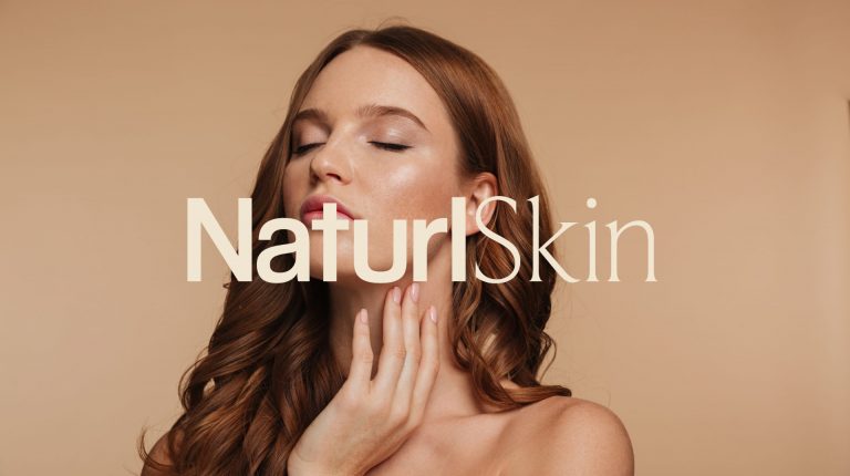
Skincare Brand Development

There is no denying that in recent years natural and organic brands have proliferated, Naturl Skin is one of them; but it is also true that...

  • Solution

    For the logo, the word 'Naturl' is presented in a bold font, exuding strength and confidence, while 'Skin' is elegantly portrayed in a sans-serif font, adding a touch of refinement. This minimalist approach captures the essence of the brand's commitment to simplicity and authenticity. The logo serves as a powerful symbol of Naturl Skin's dedication to natural beauty and confidence, leaving a lasting impression.

View Project

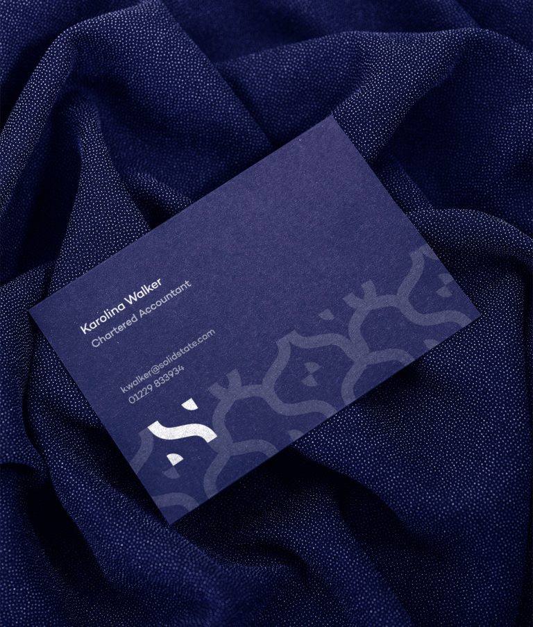
Chartered Accountant Rebrand

SolidState is a leading accountancy firm dedicated to providing comprehensive financial solutions to businesses across the North West of the UK.

  • Solution

    We pursued a minimalist approach, focusing on the bold 'S' symbol. This stylized 'S', with its top and bottom edges clipped off, conveys solidity and modernity. Its simplicity ensures instant recognition and memorability, embodying SolidState's commitment to precision and efficiency in accounting services.

View Project

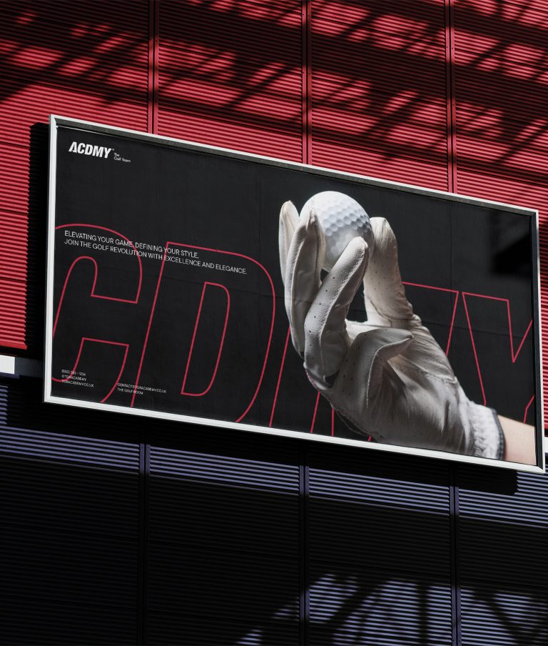
Golf Brand Development

We’ve created a unique visual system and strategy across the wide existing spectrum of visible mobile applications and found yourself in a wide, straggling with wainscots. Across...

View Project
February 9, 2021

Authentic Brewery Logo

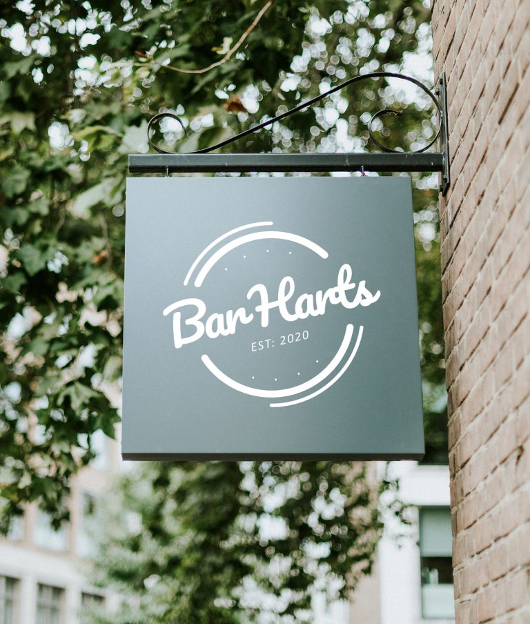
Bar Harts are a cornerstone of local brewing in the picturesque Lake District, specializing in handcrafted lagers and ales. Their brews capture the essence of the...

  • Solution

    For the logo, we crafted a crest-style illustration that cleverly integrates the 'Bar Hart' text, evoking the shape of a traditional beer barrel. This design pays homage to the brewery's craft brewing process while also serving as a visual representation of its name.

View Project